ComScore

The 8 Most Common Living Room Design Mistakes and How to Avoid Them

living room mistakes art too high

At this point, you’ve been to enough bridal showers and Thanksgiving dinners to know what you do and don’t like about other people’s living rooms. And while most of our friends have good taste, there are a few mistakes that nearly everyone makes. Here, eight of the most common living room design mistakes and what you can do to fix them.

living room mistakes all white
Getty Images

1. Mistake 1: Not Enough Color

We know, you’re going for minimalist. But zero color can easily look less modern and sleek and more boring and sterile.

living room mistakes pops of color
Nelle G/Getty Images

2. Solution: Baby Steps

Throw pillows! Art! You don’t have to paint the walls terra-cotta, but pops of color will give a room personality and liveliness.

living room mistakes matching furniture
Hikesterson/Getty Images

3. Mistake 2: Matchy-Matchy Furniture

Step away from the Price Is Right matching living-room set.

living room mistakes mix furniture
Hikesterson/Getty Images

4. Solution: Mix It Up

Instead, go for furniture that’s an eclectic mix of texture, size and time period. As long as the proportions are right and you have unifying elements (like color family), it’ll all tie together.

living room mistakes overhead lighting
Yuri Arcurs/Getty Images

5. Mistake 3: Only Overhead Lighting

This isn’t a dressing room, people.

living room mistakes area lighting
Getty Images

6. Solution: Area Lights

Play around with table and floor lamps, and install some dimmers, stat. Different sources, heights and brightness will yield a warm, flattering glow.

living room mistakes furniture walls
vinct/Getty Images

7. Mistake 4: All Furniture Against Walls

You’re just trying to create the illusion of more space, but arranging everything flush against the wall creates an overly formal vibe.

living room mistakes furniture middle of room
Twenty20

8. Solution: Move to the Middle

Unless there’s something inherently embarrassing about the back of your couch, bring the pieces together to create cozy areas where guests can intimately chat.

living room mistakes no end tables
Archideaphoto/Getty Images

9. Mistake 5: No End Tables

You’re going to balance that glass of Malbec on your sofa cushion? Yeah, didn’t think so.

living room mistakes end table
cirano83/Getty Images

10. Solution: End Tables

Duh.

living room mistakes art too high
Vinct/Getty Images

11. Mistake 6: Art Hung Too High

Hanging photos and paintings mere centimeters from the ceiling doesn’t heighten the room, it just makes us crane our neck to get a good view.

living room mistakes art
Twenty20

12. Solution: Think Eye Level

Art should be hung so that the center of the piece is about 60 inches from the floor. (Psst, here’s a cheat sheet.)

living room mistakes small rug
Getty Images

13. Mistake 7: Too-Small Rugs

Yes, rugs are expensive. But if the proportions are off, it can mess with the decor of the whole room.

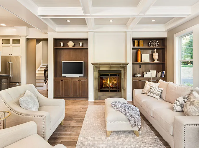
living room mistakes big rug
Twenty20

14. Solution: Fill the Space

As a general rule, a living-room rug should touch the front legs of every piece of nearby furniture (but it’s OK to go bigger).

living room mistakes writing desk
Twenty20

15. Mistake 8: Useless Furniture

A writing desk may have seemed like a good idea at the time, but are you ever actually going to use a writing desk?

living room mistakes desk
Katarzyna Bialasiewicz/Getty Images

16. Solution: Buy What You Need, Then Design Around It

There’s no shame in having an office area in the living room, as long as you use it. Make design choices that suit your lifestyle.


jillian quint editor in chief purewow

Editor-in-Chief

  • Oversees editorial content and strategy
  • Covers parenting, home and pop culture
  • Studied English literature at Vassar College